Your business card gets judged by touch before anyone reads it. Here's how we help customers choose between 250, 300 and 350 GSM, and matte, glossy, velvet or uncoated.
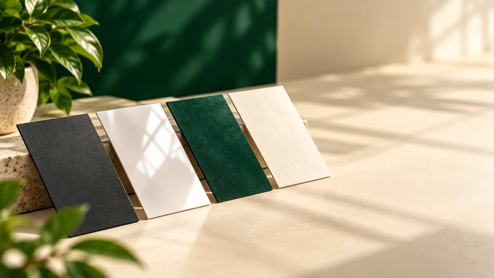
Here's something we notice every single day at the print desk. When a customer picks up a sample business card, they don't read it first. They rub it between their fingers. Then they tilt it under the light. Only after that do they look at the design.
That small ritual tells you everything. People judge a card by how it feels before they judge what it says. So if you're getting cards printed, the two decisions that matter most aren't the font or the colour. They're the paper weight and the finish. Let's go through both the way we'd explain them across the counter.
The standard business card in India is 89mm by 51mm, the same 3.5 by 2 inches used in most of the world. It fits every wallet and cardholder your clients already own, so we rarely suggest changing it.
One thing that trips people up: set your design canvas to 92mm by 54mm, not 89 by 51. That extra 1.5mm on each side is called bleed. It lets your background colour run right to the edge after the sheet is cut. Keep your name, number and logo at least 3mm inside the edge, because cutting has a tiny margin of error and you don't want your phone number losing a digit.
GSM means grams per square metre. Higher number, thicker and stiffer card. On our business cards you can pick from three:
250 GSM is firm and professional with a little give. It's what we recommend when a team hands out hundreds of cards at a trade show or a busy shop counter, where you want good quality without overspending on cards that end up in a bag of brochures.
300 GSM is the one most people end up choosing, and for good reason. It feels substantial in the hand but still slides easily into a wallet. If you're unsure, start here.
350 GSM is properly thick. When an architect or a jeweller hands you one, you notice the weight before anything else. It quietly says, "we pay attention to detail."
A simple rule we share with customers: the more a single client is worth to you, the heavier the card should be.
Smooth, no shine, easy to read under any light, and fingerprints barely show. Colours look rich but calm. Matte works for nearly everyone, from chartered accountants to small cafes, which is exactly why it's our most ordered finish.
Glossy has a shiny coating that makes colours jump. If your card carries a photo of your food, your property or a bright brand colour, gloss shows it off. The catch? It reflects light, and you can't really write on it. A customer once told us her receptionist kept smudging appointment times on their glossy clinic cards. She switched finishes on the next reprint and the problem disappeared.
This is the one people don't expect. Velvet looks matte from a distance, but it has a soft, almost suede-like feel. Consultants, salons and design studios love it because it feels expensive without shouting about it.
No coating at all, so you get the natural texture of the paper. It's the only finish you can write on comfortably with any pen, which matters a lot for doctors, salons, tutors and anyone who notes the next appointment on the back. Colours look slightly softer and more earthy, a nice fit for handmade and eco-conscious brands.
| Finish | How it looks | Can you write on it? | Good for |
|---|---|---|---|
| Matte | Smooth, no glare | With most pens | Almost every business |
| Glossy | Shiny, vivid colour | Not really | Photo-heavy, bold brands |
| Velvet | Soft-touch, premium | A little | Consultants, salons, studios |
| Uncoated | Natural paper texture | Yes, easily | Clinics, tutors, eco brands |
You'll also see a choice of paper type. Art paper has an ultra-smooth coated surface that holds fine lines, gradients and photos beautifully. Normal paper is simpler and cheaper, and perfectly fine for clean, text-led designs. If your logo has thin strokes or a gradient, go with art paper. You'll see the difference.
We nearly always suggest printing both sides. Think about how people actually contact you now. Most enquiries in India arrive on WhatsApp. A clean front with your logo and name, and a back with your WhatsApp number, a QR code to your Google Maps listing and two or three key services, works far harder than a cramped single side.
If you're a lawyer, CA or consultant, we'd go 350 GSM in matte or velvet, double-sided, with restrained colours. A restaurant or cafe usually looks best on 300 GSM glossy with a mouth-watering photo. Clinics and salons do well with 300 GSM uncoated so the back can be written on. Startups tend to like 300 GSM matte with a QR code on the back. And trade show teams get the best value from 250 GSM matte in bigger quantities.
The first is tiny text on a busy background. Anything under 7pt gets hard to read, especially on glossy stock under shop lights. The second is very thin white lines on a dark card. They can fill in during printing and simply vanish. The third, and the most painful, is a phone number sitting right at the edge. Respect that 3mm safe zone and you'll never lose a digit.
Check that your canvas is 92 by 54mm, your images are at least 300 DPI, and your file is in CMYK colour mode, since RGB colours shift when printed. A vector PDF gives the sharpest result. We'll also send you a digital proof before anything goes on press, so you get one last look.
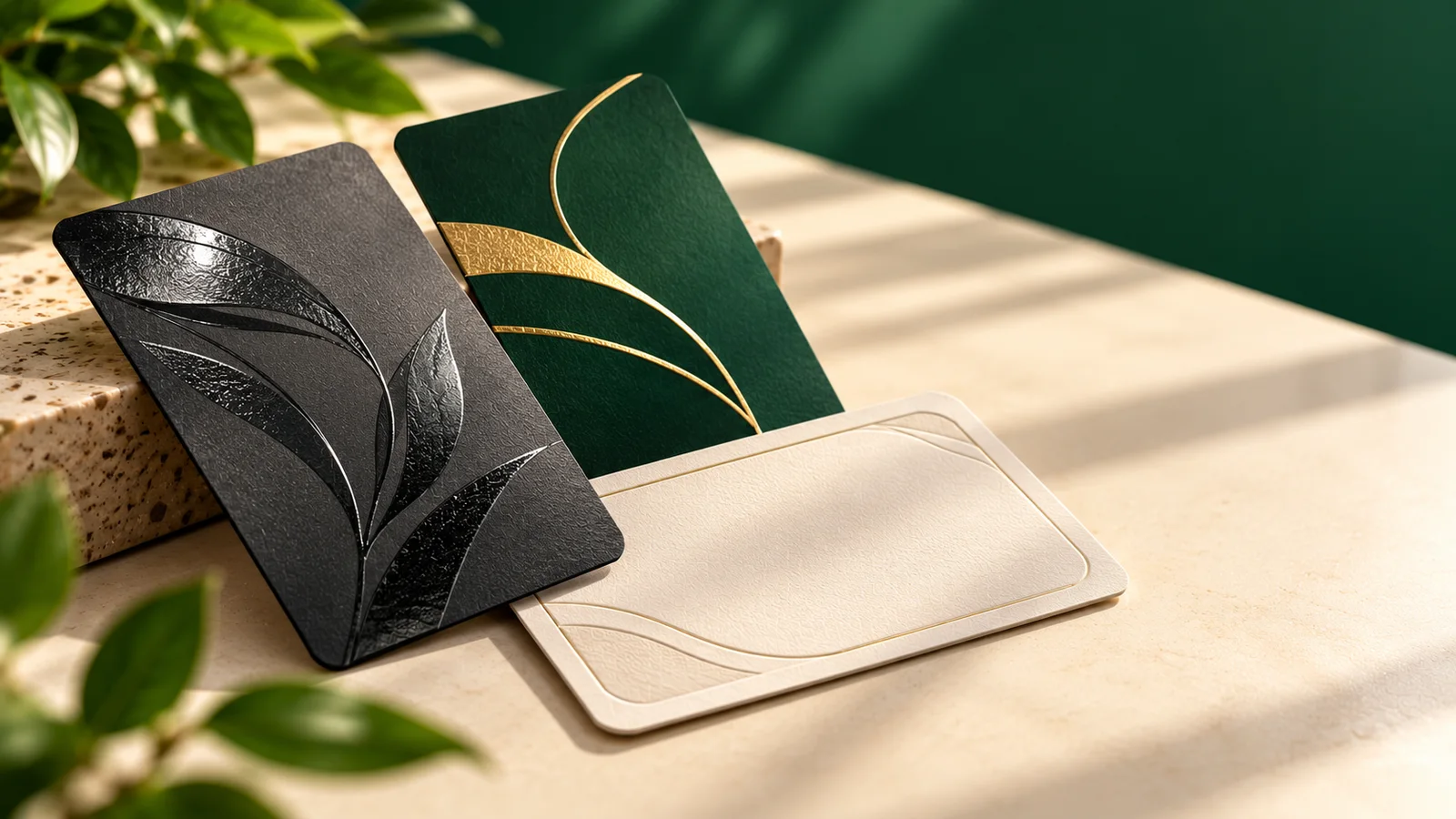
If you'd like your logo to shine when the card tilts, or your name to be raised so people can feel it, have a look at our UV business cards with spot UV, foiling, embossing and rounded corners. They start from Rs. 1175, while our standard business cards start from Rs. 750.
Still torn? Pick 300 GSM matte, print both sides, and you'll rarely regret it. Then come back and tell us how many people commented on how it felt.