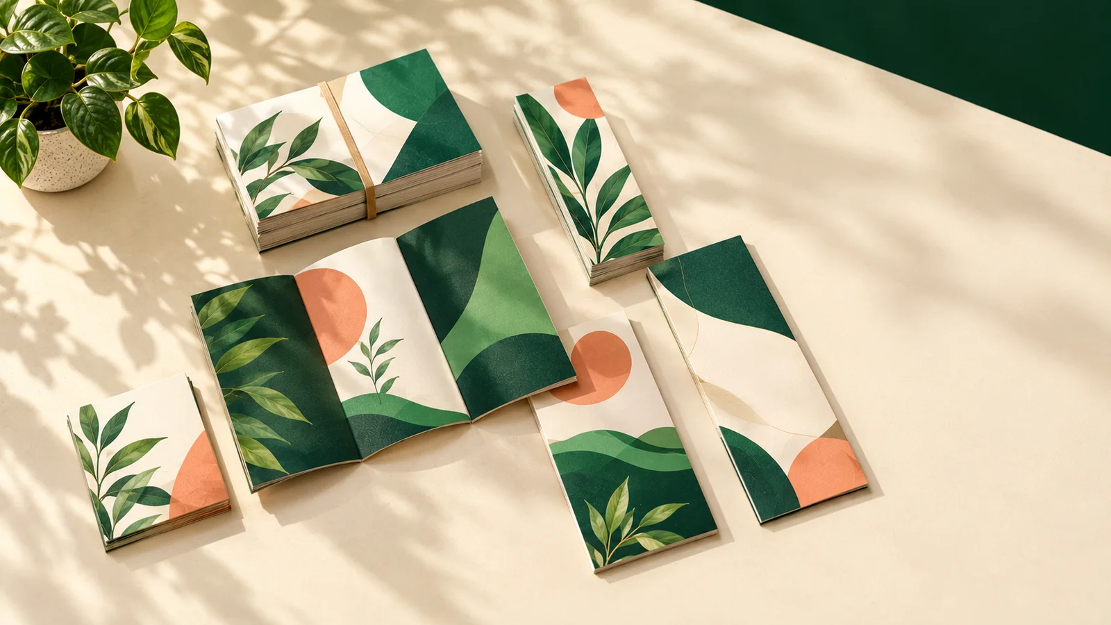
The fold decides the order in which people read your story. Here's how bi-fold, tri-fold, Z-fold and gate-fold brochures behave, and which one fits your content.
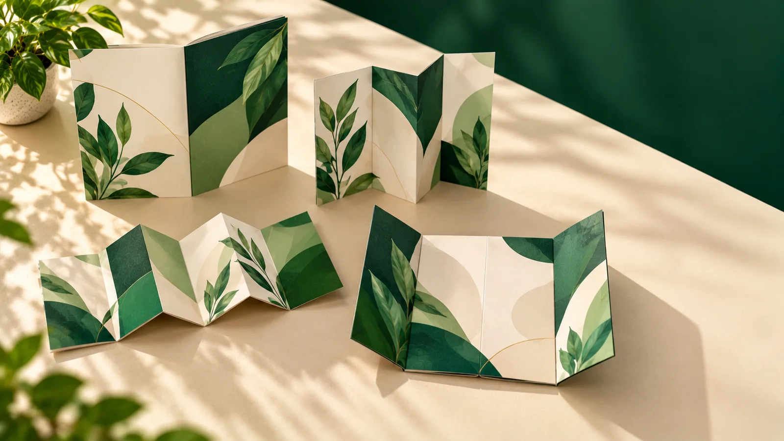
A coaching institute owner came to us last year with a beautiful brochure design. Great photos, sharp copy, everything in place. There was just one problem. The batch timings, the single thing every parent wanted to see, sat on an inside flap that you only noticed after unfolding the whole thing. It was the wrong fold for the job.
That's the thing about brochures. Two brochures can carry the exact same words and photos and perform completely differently, because the fold decides what people see first, what they discover next and what they might never find. So before you finalise a design, it's worth spending five minutes on the fold.
| Fold | Panels | Folded size from A4 | Works well for | Starting price |
|---|---|---|---|---|
| Bi-fold | 4 | A5 (148 x 210mm) | Menus, company profiles | Rs. 140 |
| Tri-fold | 6 | About 99 x 210mm | Services, price lists, clinics | Rs. 153 |
| Z-fold | 6 | About 99 x 210mm | Steps, timelines, maps | Rs. 153 |
| Gate-fold | 6 | About 105 x 210mm | Launches, premium reveals | Rs. 178 |
All four come in A4 or A3 flat sizes, printed in full colour on both sides, matte or glossy, with optional lamination.
A bi-fold brochure is one sheet folded down the middle, like a greeting card. You get a front cover, an inside spread that reads as one big page, and a back cover. A4 folds to A5, and A3 folds to A4.
Because the panels are large, bi-folds love big images and a few bold messages. That's why restaurants use them as menus and schools use them for admissions. If your story has three or four key points rather than ten, a bi-fold keeps it uncluttered.
Layout tip: put the fold exactly in the centre, keep anything important 3mm away from it, and don't print the fold line itself. It's a guide, not part of the design.
The tri-fold is the one you've seen in every clinic waiting room and hotel lobby. One sheet folds into three panels, so you get six surfaces to print on. From A4 it closes to roughly 99 by 210mm, small enough for a shirt pocket, a DL envelope or a display rack.
What makes it work is the predictable reading order. The cover grabs attention, the first flap teases, and opening it fully reveals a three-panel inside spread. That's perfect for a list of services, a doctor's specialities, a travel package or a price guide.
Here's the detail most first-timers miss: the panel that folds inside has to be about 2mm narrower than the others, or it bulges. On A4, design two panels at 100mm and one at 98mm. Keep text 5mm from the trimmed edges and 3mm from the folds.
A Z-fold also has three panels, but they fold back and forth like a concertina. All three panels are the same width, and the whole sheet opens flat in one easy pull.
We recommend it whenever content naturally flows left to right: a step-by-step process, a timeline of your company's journey, a product range from basic to premium, or a map with directions. Opened fully, the inside can even be one continuous panoramic design, which looks lovely for real estate projects.
Design all three panels at equal width, mark the folds as guides only, and keep text 3mm clear of each fold.
A gate-fold has two side panels that fold inwards and meet in the middle, like a pair of doors. Open them and there's a centre spread twice the width of the closed brochure. It creates a tiny moment of anticipation, which is why it's popular for product launches, housing projects, premium event invitations and annual highlights.
It needs more precision to fold well, which is why it starts a little higher. Each door is a quarter of the sheet width and the centre is half. Make each door 1 to 2mm narrower so they close without overlapping, and keep text 4mm from all folds.
130 GSM is light and economical, ideal when you're distributing in large numbers. 170 GSM feels noticeably sturdier and folds crisply, which makes it our usual recommendation. 250 GSM is almost card-like and great for launches and leave-behinds you want people to keep.
Matte is calm and easy to read. Glossy makes photos vivid. Lamination adds protection against fingerprints, moisture and repeated handling, and we'd suggest it for gate-folds and for any brochure that will sit on a reception counter for weeks.
Count your messages first, then choose. A few messages with big visuals suit a bi-fold. Several services or prices to list suit a tri-fold. Anything that runs in sequence, like steps, a timeline or a map, belongs on a Z-fold. And if it's a launch that deserves a little drama, go gate-fold.
Design the full flat sheet with 3mm bleed, at 300 DPI or higher, in CMYK, and export a print-ready PDF. Then print it on plain paper at home and fold it by hand. It takes two minutes, and it's the fastest way to catch a panel in the wrong place. Remember, the front cover of a tri-fold is not the left-most panel of your flat file, which surprises almost everyone the first time.
That coaching institute? On the reprint, we moved the batch timings to the first panel people see when they open the cover. Same design, same words, just a smarter fold. Compare the options on our brochure pages and upload your flat artwork when you're ready. We'll send a digital proof so you can check the panel order before printing.