Quotations, offer letters, GST paperwork and official replies still travel on letterhead. Here's how to choose the paper, lay out the design and keep it printer-friendly.
Every few months, someone asks us whether letterheads are still worth printing. Everything's on email and WhatsApp now, right? It's a fair question. But then the same person tells us they need to send a quotation to a government office, issue an offer letter to a new hire, or reply to a GST notice. And suddenly a plain white sheet with their name typed at the top doesn't feel quite right.
In India especially, a lot of important business still happens on paper. Tenders, quotations, purchase orders, authority letters, experience certificates, bank correspondence. A proper letterhead tells the reader, before they've read a word, that they're dealing with an established business. So yes, you still need one. Here's how to get it right.
A4 (210 x 297mm) is the standard for business letters here, and it's what every office printer, file and envelope is built around. There's really no reason to choose anything else. When you design, set your canvas to 216 x 303mm. That extra 3mm on every side is bleed, so a coloured header or border can run right to the edge without a white sliver after cutting.
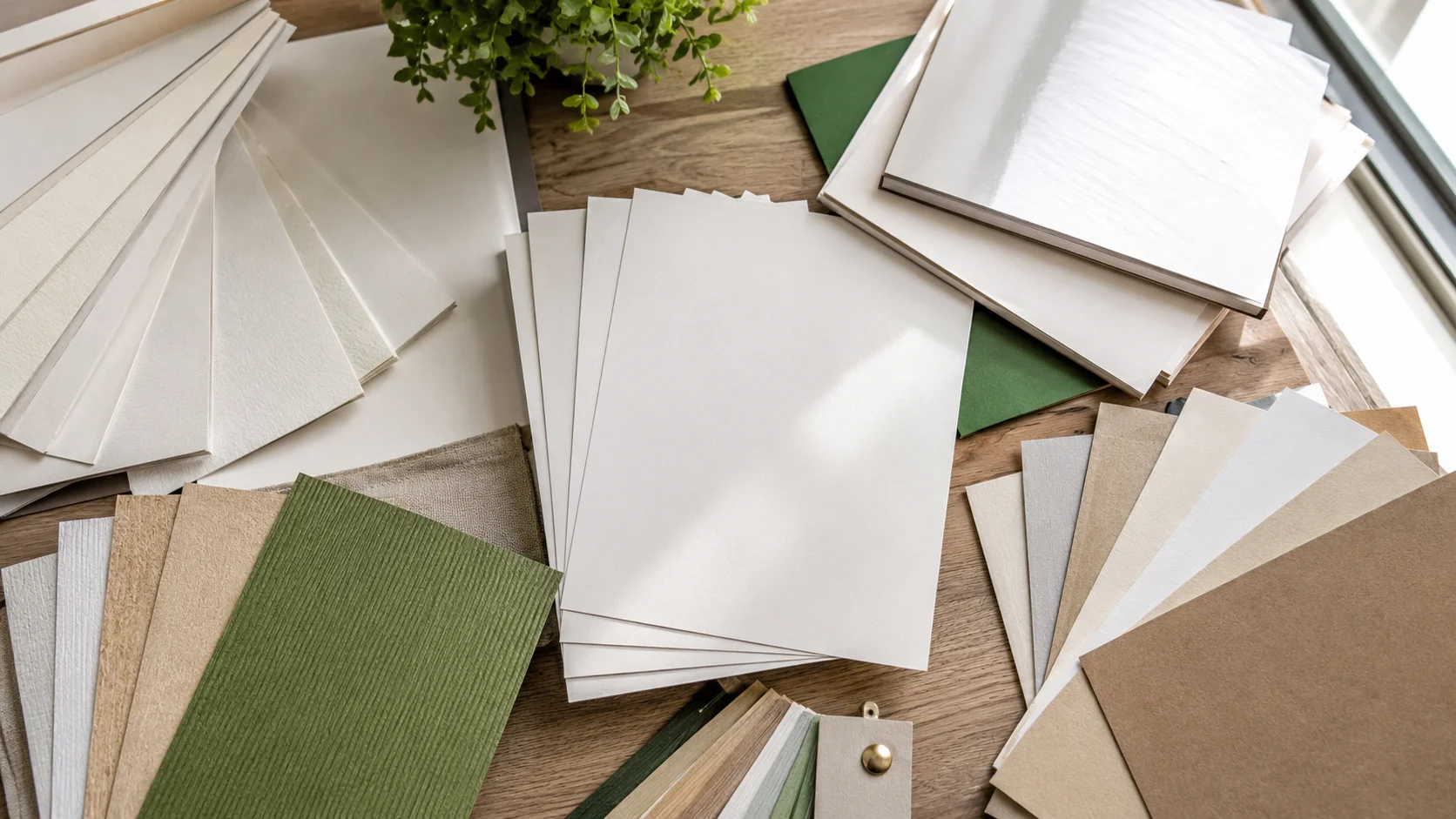
Our letterheads come in three weights, and the difference is noticeable the moment someone picks up the letter.
80 GSM is the everyday standard. It's what most offices use for routine letters, and it runs smoothly through any printer. 100 GSM feels a step thicker and more confident, a nice middle ground for client-facing letters. 120 GSM is properly substantial. We'd use it for proposals, offer letters and anything signed by a director.
You can also choose between bond paper and normal paper. Bond paper has a slightly crisper, more premium feel and is the traditional choice for business stationery. Normal paper is simpler and a touch more economical for high-volume use.
All our letterhead sheets are uncoated, which matters more than people realise. Uncoated paper takes ink from your office printer cleanly, and you can sign it with any pen without smudging. They're safe in both inkjet and laser printers.
The most common letterhead mistake is over-designing it. Remember, the letterhead is the frame. The letter is the picture.
Keep your logo and header within the top 50mm of the page, and your footer within the bottom 25mm. Everything in between should be clear, or at most carry a very faint watermark, so whatever you type over it stays easy to read. We've seen beautiful letterheads where a bold background pattern made every typed letter look messy. Subtle wins here.
At the top, your logo and registered business name. In the footer, or under the header, your full address, phone, email and website. Many Indian businesses add their GSTIN, and private limited companies usually include their CIN as well. If you have multiple branches, the footer is a tidy place to list them, or you can use the back of the sheet.
Should you print both sides? It depends on how you use them. Some businesses put their standard terms and conditions on the back of quotation sheets, which saves an extra page every time. Others keep the back blank. Both are perfectly professional.
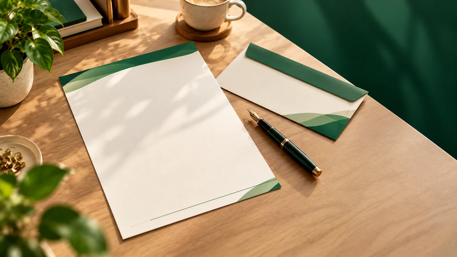
A letterhead looks its best as part of a set. If your business cards, letterheads and envelopes share the same colours, fonts and logo placement, your brand looks consistent and deliberate. Take the exact CMYK values of your brand colours from your card design and use them on the letterhead too, so the green on your card matches the green on your letter.
Some businesses ask why they shouldn't just put their logo in a Word template and print everything on the office printer. You can, and for internal notes it's fine. But there are real differences. An office printer can't print to the edge of the page, so any coloured header or border ends with a white margin. Inkjet colours often shift from one cartridge to the next, so your green looks different every month. And regular copier paper feels thin next to proper bond paper.
The approach most of our customers settle on is a mix: professionally printed letterheads with the header and footer already on them, loaded into the office printer for the letter text itself. You get consistent brand colours and edge-to-edge design, plus the flexibility to type whatever you need. It's the best of both.
Store your letterheads flat in the original ream wrapper, so they don't curl or collect dust. Keep them away from damp walls, because paper absorbs moisture and that can cause printer jams. Try not to touch the printed area before use; fingerprints can affect how your office printer's ink sits on the page. When loading the printer, check which way up the sheet goes with a single test page before printing a fifty-page tender. Everyone learns that lesson once.
Design at 216 x 303mm with bleed, keep text 5mm in from the edges, and use a 300 DPI logo, ideally vector. Work in CMYK. If your header has thin lines or small text, make sure they're not too fine, since very thin strokes can look weak on uncoated paper. And proofread the GSTIN digit by digit. A wrong digit on a letterhead is a mistake you'll repeat on every letter you send.
Our letterheads start from Rs. 525, with the price depending on paper, weight, sides and quantity. For most small businesses, one well-planned print run lasts many months.
So, does your business still need a letterhead? If you ever send a quotation, an offer letter or an official reply, the answer is yes. Design it once, design it calmly, and let it quietly do its job every time a letter leaves your office. You can set it up on our letterheads page in a few minutes.